| PKO Bank / Robert Majkut Design设计师:Robert Majkut Design 地理位置:波兰首都华沙 客户: PKO Bank Polski S.A. 面积:483平方米 年份:2011 Architects: Robert Majkut Design Location: Warsaw, Poland Client: PKO Bank Polski S.A. Area: 483 sqm Year: 2011 Photographs: Szymon Polański   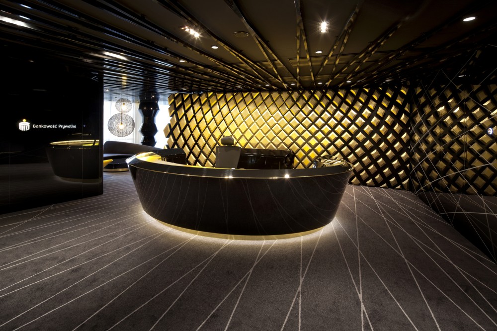 © Szymon Polański Robert Majkut Design 为 PKO 银行做的室内设计沿用了其商标的颜色,黑色、白色和金色。为了打造私人银行的现代与优雅,设计师大量的运用精美的线条以及曲线网格等图形。室内装饰简洁优雅,但是设计师利用特殊的软件进行参数设计,创造出繁复有序又抽象的结构,力求营造出3D效果 The starting point for this project was Bank’s corporate identity developed by White Cat Studio, above all the modernized logo of PKO Bank Polski in its elegant color version for Private Banking sector – black, white and gold, which created a set of basic colors for the interior. Other graphical elements were also inspiring – in particular one decorative motif consisting of a grid of elegant, sinusoidal lines, consistently applied in the graphic design for the PKO Bank Polski Private Banking. 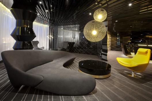 © Szymon Polański © Szymon PolańskiThe theme of delicate grid was treated in a very innovative way – a bi-dimensional pattern was completely transformed by introducing an additional dimension: it was made spatial by being projected on the tri-dimensional model of the interior. To achieve this effect special software for parametric design was used, which allowed for the creation of a complex and ordered structure formed as a transformation of the subtle grid of lines converging in one abstract point. This complicated geometry setting has become a model to be filled with interior design solutions.  © Szymon Polański © Szymon PolańskiAs a composition it is coherent and complete, being a real challenge at the stage of realization. The final effect is a balance between purely aesthetic choices and a mathematical order, accepted by the designer, yet generated by software that was treated not only as a tool, but as a creative factor. It is a kind of metaphorical code which presents the character of the institution and its services, being a mix of mathematical analyses and human element of experience, knowledge, and decision making process.  © Szymon Polański © Szymon PolańskiCorporate colors of PKO Bank Polski – black, white and gold – have been applied with full consequence, further complemented by shades of gray. The designer has taken an specific way to play with the tones of gold which are set in the interior in a kind of drama. Gold balances strong, graphic contrast between black and white and has unique decorative qualities and rich symbolism – as a warm and noble color referring to such values as prestige, stability and prosperity. 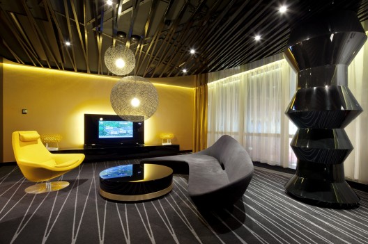 © Szymon Polański © Szymon PolańskiThe branch is clearly divided into two functional areas – of customer service and the back-office. In those two separate zones, the design solutions are aimed at effectively matching various spaces with their specific functions.  Plan Plan     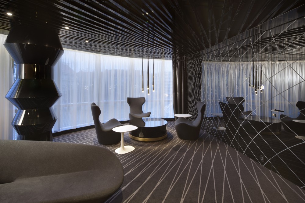  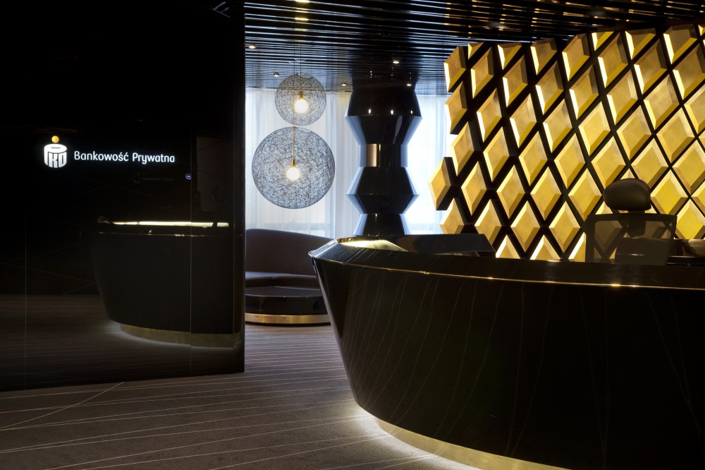           |