| 来自纽约的学生Albert Son设计,以经典字体Helvetica字体来重新设计的酒店品牌。 个人项目探讨应用流行的字体为酒店品牌的主要元素。设计师看到后是否有种亲切感。 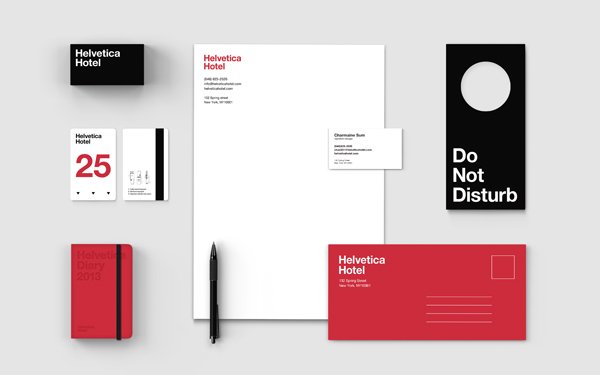 Idea of the branding is to create a hotel that is not only a young, fun and easy place to stay and relax, but also a up-to-date(最新的) and trendy(时髦的) landmark(陆标) that could sell cultures and lifestyles(生活方式) of the typeface Helvetica. Essential themes of the branding is based on the attributes(属性) of the typeface, which is neutral(中立的), clean, simple. As it is the most beautiful when it is by itself, focus of the overall branding was on keeping everything simple and clean in terms of typography(排印) as well as use of colors. While reinterpreting(重新解释) essential hotel products in 'Helvetica' way, the brand also introduces bunch(群) of unconventional(非常规的) items in its store with a range of categories. 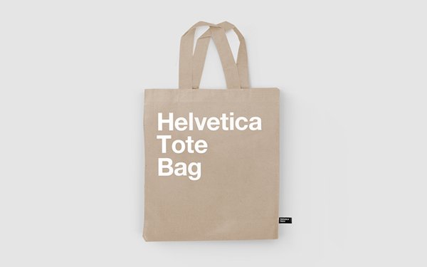 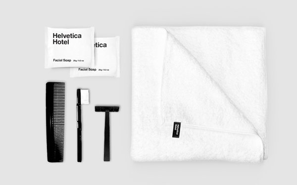 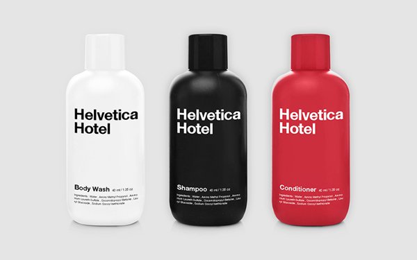  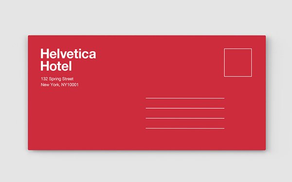 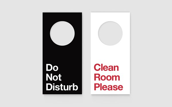  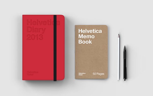 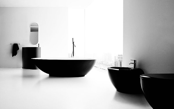 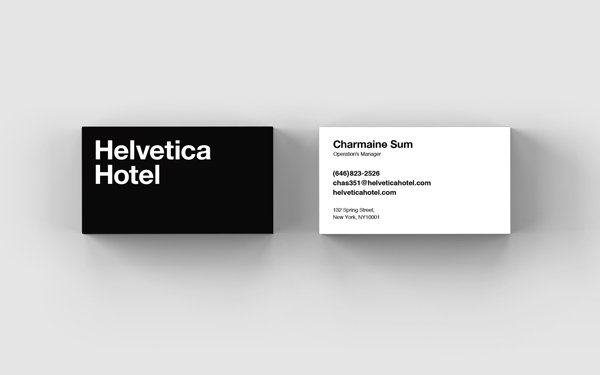 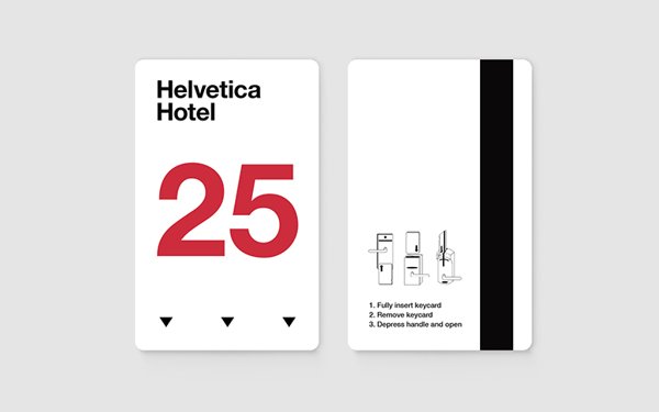  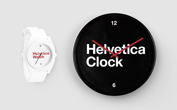 |